Category
Art & Culture / Retail
Graphics Project Year
2020
Photography Studio
Wen Studio
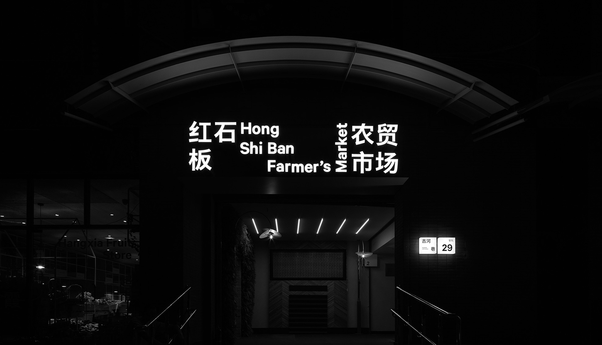
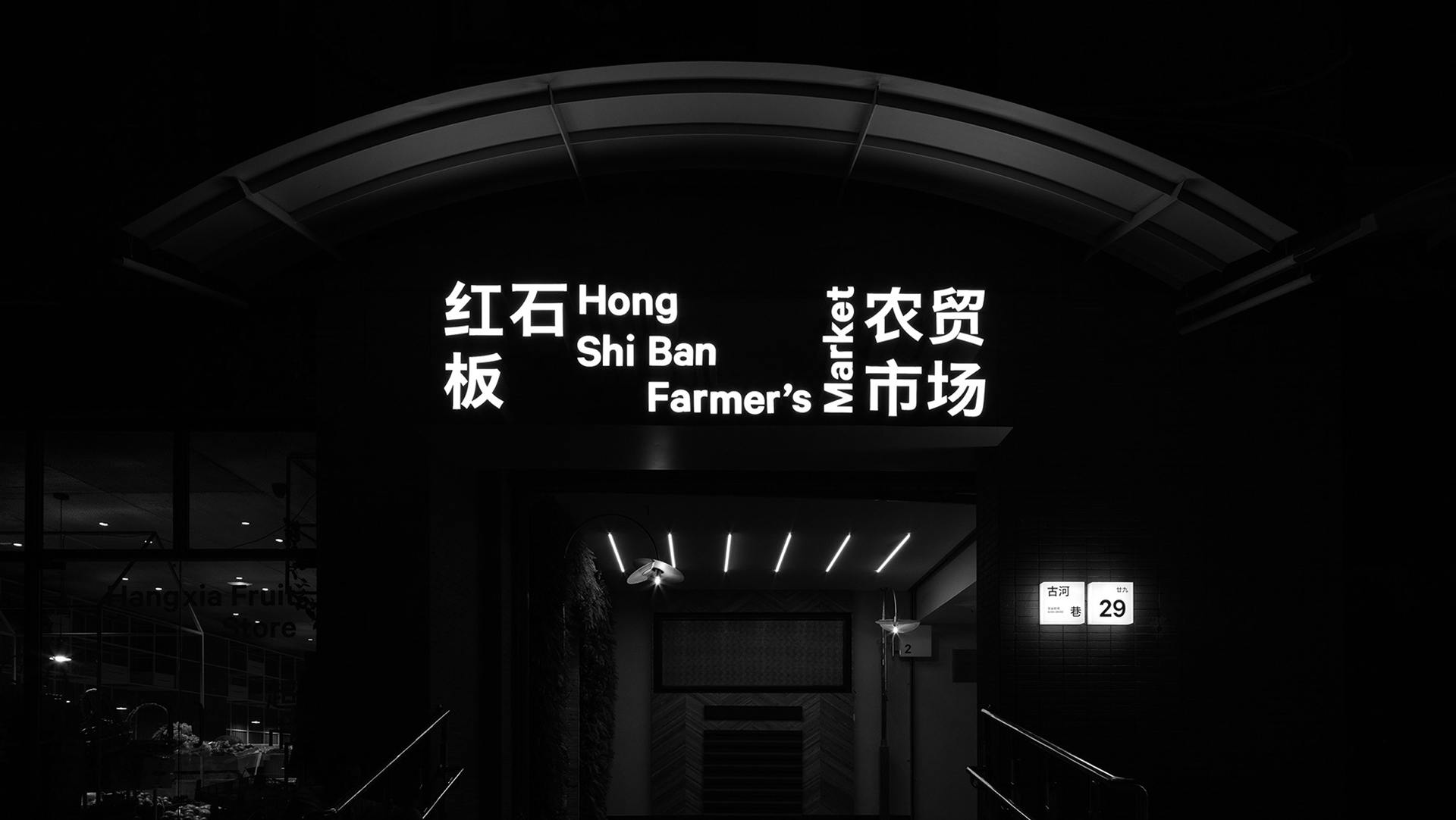
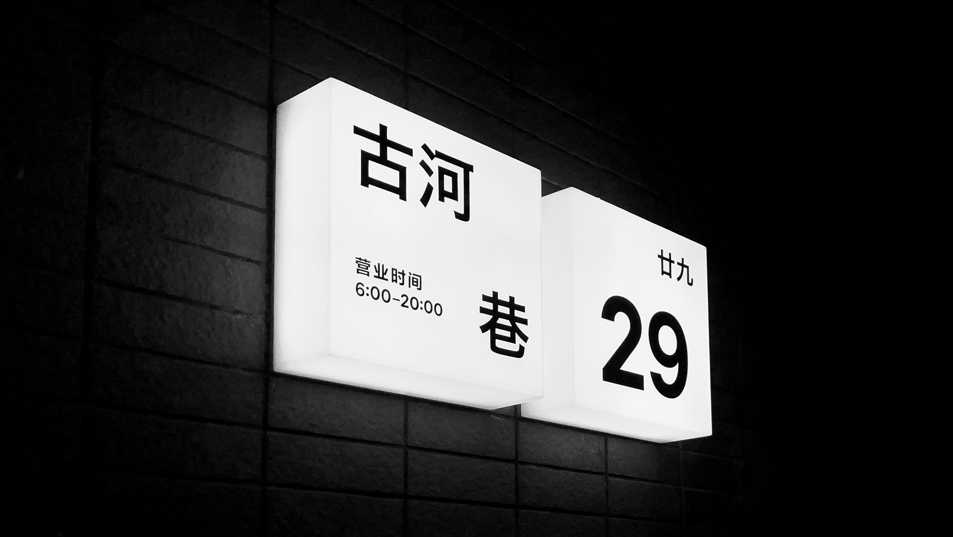
Project Address
No. 29 Guhe Lane, Chaowang Road, Gongshu District, Hangzhou, Zhejiang
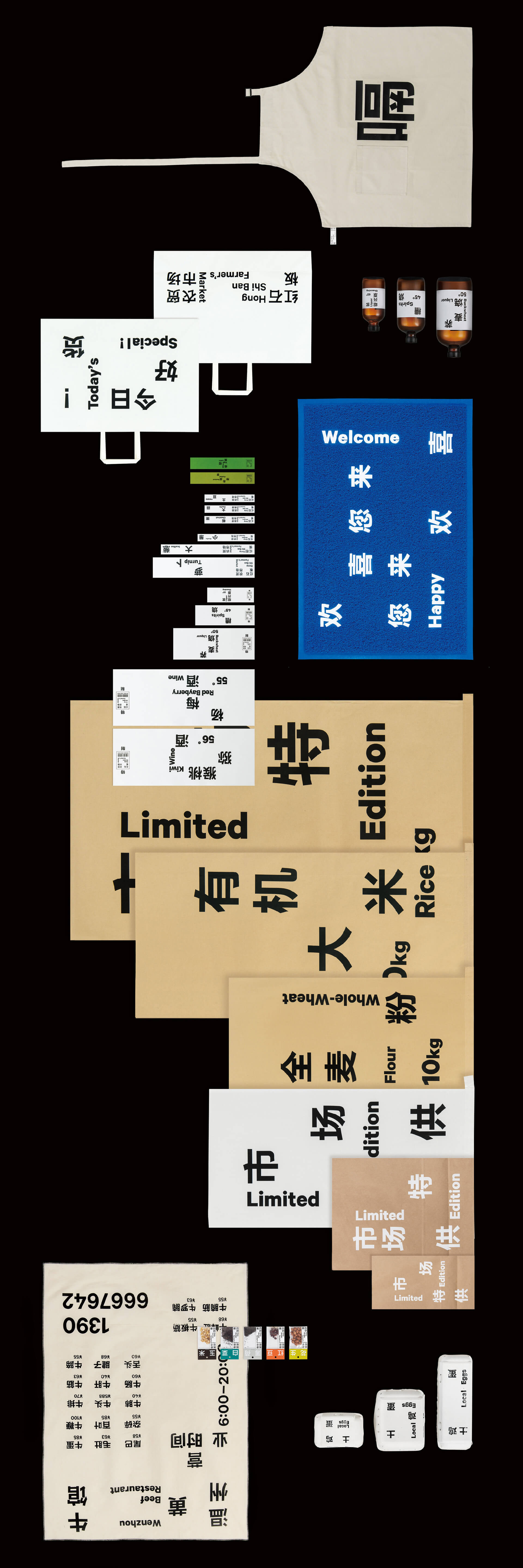
Hong Shi Ban Farmer’s Market is a traditional farmer’s market in the old town of Hangzhou. The aim of the project hoping to attract young groups to patronize the market. It was revamped in the summer of 2018——from space to branding design, and the branding of the Hong Shi Ban Farmer’s Market was redesigned for this transformation.
The new image takes the Chinese word as the main visual recognition, it assumes the "function" is also the main "formal language". We just scatter the original order of the text and set up reading barriers to get a fresh reading logic and visual experience. Chinese characters are hieroglyphics, each word has its own meaning, which is not the same as the English need multiple letters to form a word.The combination of Chinese is like a dot-shaped composition, the western language is linear, the point and line composed of the word game is similar to the rhyme of poetry, forming an interesting system. The sense of handicap and multiplicity that comes with reading is something we particularly emphasize in design.